N:OW for Net-Zero Branding
Logo design
Brand guideline development
Brand voice
Goal
The goal of N:OW for Net-Zero’s brand design was to create a brand that is appealing to students and educators, and that effectively communicates N:OW for Net-Zero's mission of empowering students and educators with the resources they need to explore and implement meaningful climate action in pursuit of net-zero.
Solution
Logo
The N:OW for Net-Zero logo is not just a symbol, it's a call to action. Its design cleverly integrates multiple layers of meaning to resonate with students and educators.
The logo incorporates elements from a digital clock, a stark reminder that we don't have time to waste in the fight against climate change.
This element embodies the "NOW" aspect of N:OW, emphasizing the need to take concrete steps towards a net-zero future.
The arrow gracefully loops around a vibrant green circle, which can represent our planet Earth, along with the zero in "net zero," both powerful symbols that represent achieving a carbon-neutral future.
Colours & imagery
The color palette features a range of bright and optimistic colors, which warmly welcomes audiences while conveying urgency.
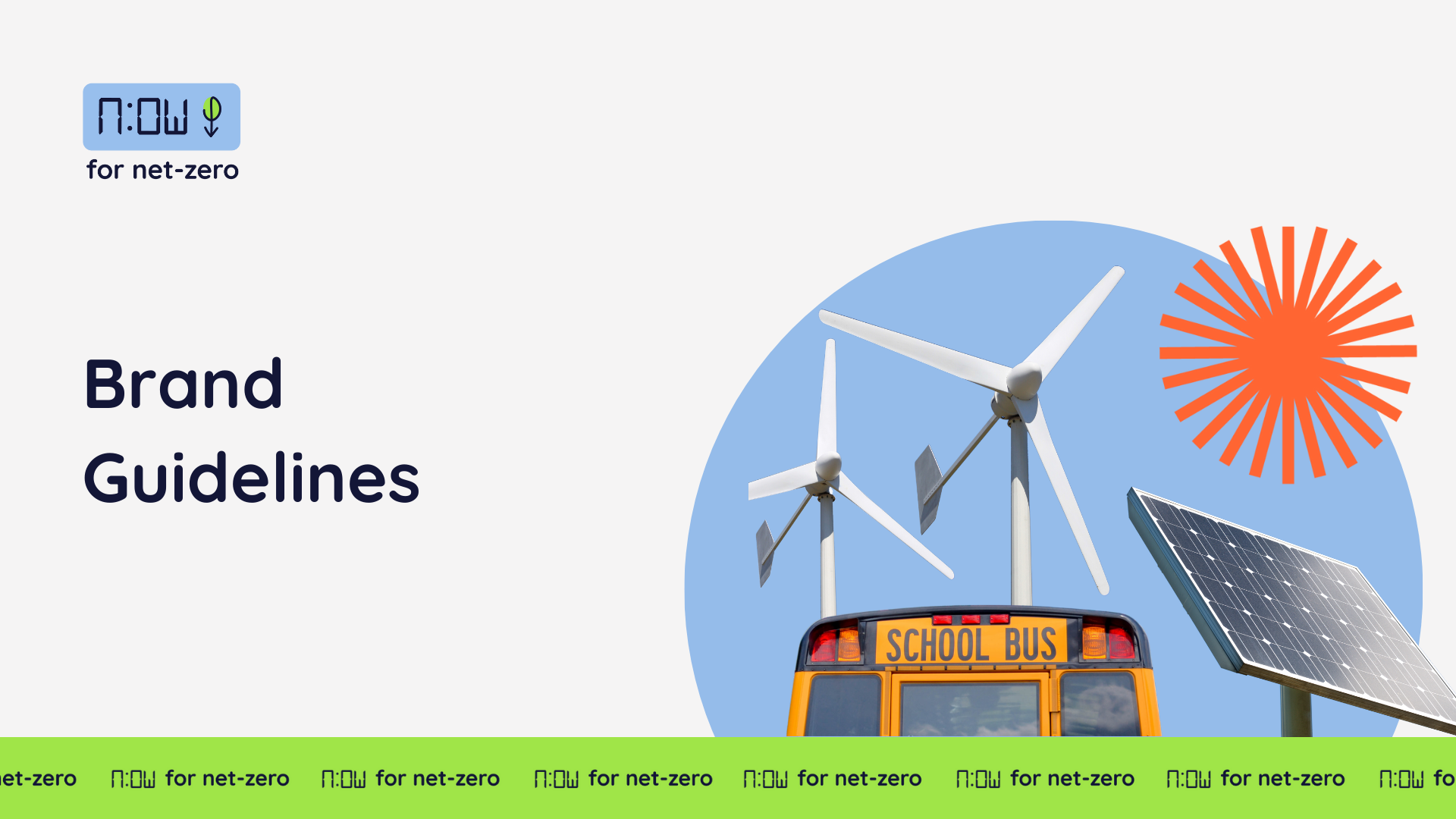
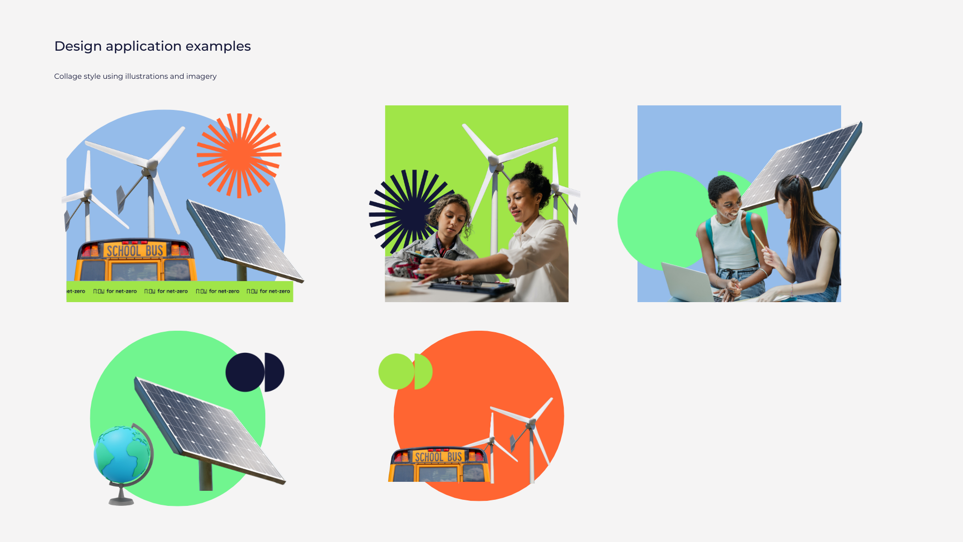
The collage style visuals and cut-out shapes reinforces the youthful and futuristic design identity. It creates a sense of energy and movement, reminiscent of a youth-designed collage. This design choice directly connects with the hands-on, student led projects that N:OW for Net-Zero supports.
Typography
The typography in the logo seamlessly integrates visual cues that resonate with students and educators. The playful, sans-serif typeface evokes a youthful spirit, fostering a sense of accessibility and engagement.
Social media


