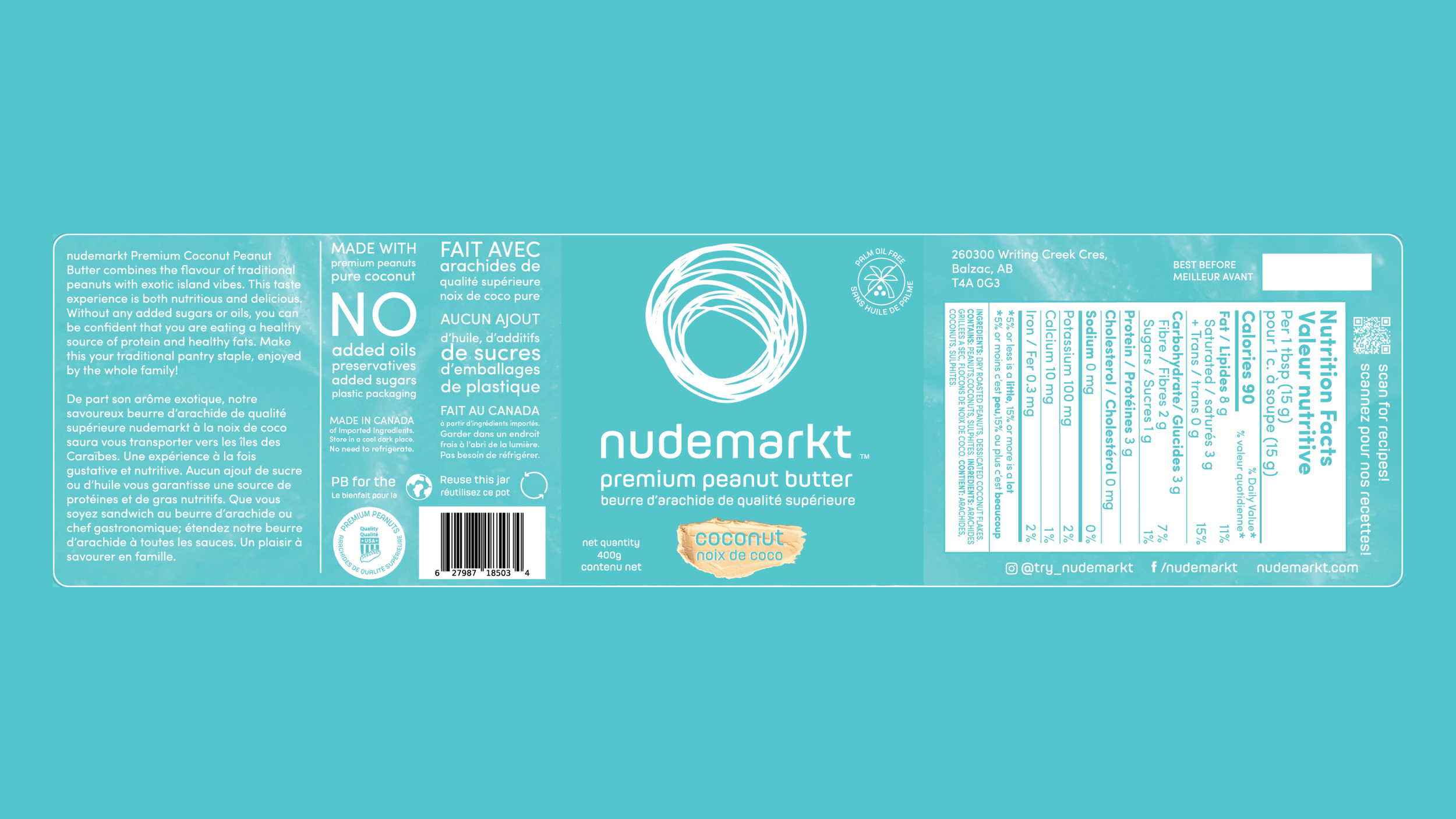
nudemarkt peanut butter packaging design
Graphic design
Packaging design
Copy writing
Goal
The goal was to create a peanut butter jar design that would truly capture attention and make it pop against the competition. We wanted to follow the trends of maximalism in design and utilize vibrant colours, drawing inspiration from brands like Poppi. At the same time, we wanted to highlight the benefits of this all-natural peanut butter with its unique and delicious flavours.
Solution
The solution? Four vibrant, colorful jars that scream "pick me!" These jars are designed to stand out in the natural peanut butter section, drawing customers in with bright hues that use the texture of peanut butter swirls on the sides of the jar. Once in hand, customers can learn more about the jar’s premium ingredients, no added oils, and local production. The copy on the label reinforces the decision to choose nudemarkt peanut butter – it's not just delicious, it's nutritious and good for the planet! And if anyone is craving some recipe inspiration, they can scan the QR code on the side.


